Web Development Laye...
Web Development Layers (CIE) IGCSE ICT (2025)
Web Development Layers (CIE) IGCSE ICT (2025)
Web Development Layers — Revised & Updated (2025)
Topics Covered
What are Development Layers?
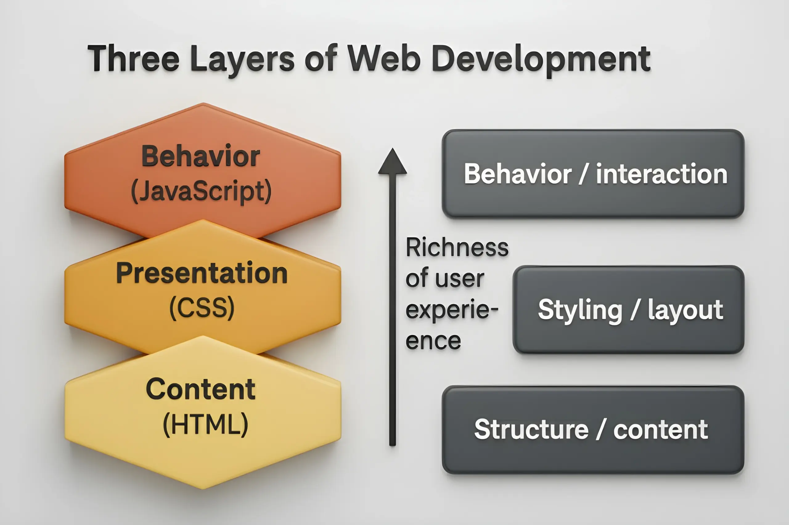
In modern web design, it’s still useful to think in terms of layers — distinct concerns that separate content/structure, presentation, and behavior/interaction. This modular separation helps maintainability, scalability, and collaboration. Over time, though, these layers have become more sophisticated, especially as web apps evolve into rich, interactive systems.
Traditionally, we speak of three layers:
Content / Structure layer
Presentation layer
Behavior / Interaction layer
Below, we describe each in turn — then show how new trends (e.g. AI in browser, edge computing, declarative UI frameworks) are enhancing or complicating that model.
Buy the Domain like Your Name at the lowest price and Develop your own portfolio website – Get World wide Job offers 🤩
1. Content / Structure Layer
This is the foundation of a webpage — the what of the page: headings, paragraphs, images, links, lists, embedded media, etc.
It is defined using HTML (Hypertext Markup Language), which gives semantic meaning to elements (e.g. <h1>, <nav>, <section>, <img>, <article>, <main>, etc.).
Using semantic HTML is important not only for structure but for accessibility, SEO, and machine parsing (search engines, screen readers).
In modern web apps, the content layer may also be dynamically generated (server-side rendering, hydration) or fetched (via APIs) and injected into the DOM (Document Object Model).
Newer considerations:
Progressive enhancement / graceful degradation: ensure basic content is accessible even if styles or scripts fail.
Content security / sanitization: for dynamic content (e.g. user-generated), ensure no harmful scripts are injected.
Hydration & SSR frameworks: frameworks like Next.js, Remix, Nuxt, SvelteKit often generate HTML on server side and then “hydrate” it on the client for interactivity.
* Free Domain Registration applies to the following extensions only: .co.za
2. Presentation Layer
This layer defines how things look — layout, colors, fonts, spacing, responsive design, visual effects.
It is primarily handled by CSS (and its successors, preprocessors, CSS-in-JS, utility frameworks).
CSS can be external files, inline styles, or embedded in style blocks. Best practice is to keep styles separate (external) where possible, to allow reuse and caching.
Key modern practices and extensions:
Responsive design & media queries — adapt style across screen sizes (mobile, tablet, desktop).
CSS Grid / Flexbox — advanced layout models for modern designs.
CSS variables (custom properties) — allow theming and dynamic styling.
CSS-in-JS / CSS modules / styled components — for component-scoped styling in frameworks like React, Vue, etc.
Utility-first frameworks (Tailwind CSS, etc.) — where classes carry style semantics, rather than writing large custom CSS.
Isolation & encapsulation: Shadow DOM (in Web Components) isolates style scope to avoid conflicts.
Optimizing performance & delivery:
• Minification, compression, critical CSS extraction
• Caching of CSS files
• Loading strategies (e.g. preload, async, media attributes)
• CSS containment, subgrid, whether to defer nonessential stylesDark/light mode theming, system preferences, high contrast modes
Emerging possibilities: Some browsers now allow limited on-device AI inference to adapt UIs dynamically (e.g. customizing layout or theme) — so presentation can become more “intelligent.” ClickIT
3. Behavior / Interaction Layer
This layer adds interactivity, dynamic behavior, logic — what happens when users click, hover, scroll, fill forms, etc.
It is handled by JavaScript (or other client-side scripting, e.g. TypeScript, WebAssembly).
Examples: form validation, modal dialogs, dynamic content loading (AJAX / fetch / GraphQL), animations, SPA routing, reactive updates.
Modern enhancements & caveats:
Frameworks / reactive libraries: React, Vue, Svelte, Solid, Alpine etc. manage state, DOM diffing, reactivity.
Declarative UI paradigms: instead of manually manipulating DOM, developers declare desired UI from state, and framework handles updates.
Progressive Web Apps (PWAs): service workers, offline caching, background sync — behavior that extends beyond a simple page.
Edge logic & serverless functions: some logic may run closer to the user (on edge nodes) rather than entirely on client or central server.
Security & sandboxing: careful to avoid XSS (cross-site scripting) vulnerabilities; use CSP (Content Security Policy).
Performance & bootstrapping: minimize script size, defer noncritical JS, code-splitting, tree-shaking, lazy-loading modules.
WebAssembly (Wasm): for performance-intensive tasks (graphics, crypto, etc.), part of the behavior layer might be handled via Wasm modules.
How These Layers Interact (and Overlap)
While conceptually distinct, in real systems the layers cooperate and sometimes blend:
HTML may include inline styles or inline scripts (though best practice is to avoid monolithic mixing).
JavaScript often manipulates CSS properties or classes to change styling.
CSS pseudo-classes (e.g. :hover, :focus) may respond to user interaction without explicit scripting.
Frameworks often tie structure, style, and behavior together (e.g. components bundle markup + style + logic).
For high performance and optimization, layering separation helps browsers cache styles/scripts once and reuse across pages.
Why Separate Layers — Benefits Remain (and Some New Ones)
Maintainability & Modularization — easier to update styles or behavior without touching content structure.
Team collaboration — designers, content authors, frontend engineers can work in parallel.
Performance & caching — browsers can cache CSS and JS separately.
Scalability & reusability — shared style libraries or utility systems across pages or applications.
Accessibility & SEO — semantic HTML + external styles/scripts makes content more crawlable and accessible.
Security — isolating scripts and content helps in applying CSPs, sanitization, and defense in depth.
Progressive enhancement — base content works even if styles or scripts fail.
Newer benefits & constraints:
Smarter rendering & adaptation: As browsers add capabilities (e.g. running lightweight models, predictive resource loading), layers can adapt (e.g. styles changed based on user behavior).
Edge / hybrid logic: Some “behavior” tasks may be pushed to edge / serverless, reducing client script weight.
Declarative and component-driven stacks: these blur rigid separation but keep the spirit of layer separation — e.g. a UI component encapsulates markup + style + logic, but does not pollute global scope.
Versioning & progressive rollouts: by isolating logic and style, one can safely rollout updates or A/B tests.
Updated Architecture Note: Beyond Classic 3 Layers
In many modern web apps, especially “web applications” (rather than simple webpages), the architecture is layered in a slightly more evolved way. A common pattern is three-tier / multi-tier architecture:
Presentation / Client / UI tier — what runs in the browser (HTML + CSS + JS)
Application / Business Logic tier — server-side logic, APIs, routing, orchestration
Data / Persistence tier — databases, caching, storage
This pattern helps in scaling, security, and clear separation of concerns. vFunction+2ClickIT+2
As web apps evolve, new layers or cross-cutting concerns arise:
API / Backend-for-frontend (BFF) — a thin adapter layer between client and multiple microservices
Edge functions / serverless — logic near the user
Middleware / orchestration / business rules
AI / inference layers — intelligent behavior, recommendation, personalization
Security / authorization / authentication layers — zero-trust, token systems, identity services Google Patents+1
Thus, the simple “content / presentation / behavior” model is still useful for thinking about front-end separation, but real production systems often extend and complicate that model.
Example — “Contact Us” Section
Structure / Content Layer (HTML):
html <section id=”contact”> <h2>Contact Us</h2> <form> <label for=”email”>Email:</label> <input id=”email” name=”email” type=”email” required> <button type=”submit”>Send</button> </form> </section>Presentation Layer (CSS / Style):
css #contact { max-width: 500px; margin: 2rem auto; padding: 1rem; border: 1px solid var(–theme-border); } #contact h2 { color: var(–theme-primary); font-size: 1.8rem; } form input, form button { display: block; width: 100%; margin: 0.5rem 0; }Behavior Layer (JavaScript):
js document.querySelector(“#contact form”).addEventListener(“submit”, async (evt) => { evt.preventDefault(); const email = evt.target.email.value; if (!validateEmail(email)) { alert(“Enter a valid email”); return; } const resp = await fetch(“/api/contact”, { method: “POST”, body: JSON.stringify({ email }), headers: { “Content-Type”: “application/json” } }); if (resp.ok) alert(“Sent successfully!”); });
Here, the content is in HTML, styling is in CSS, and logic (validation + HTTP request) is in JavaScript. In modern frameworks, you might see these bundled in components—but the same separation of concern remains at heart.
At The End
For a website to function effectively, all three layers—structure, presentation, and behavior—must be properly incorporated and balanced. Each layer plays a crucial role in creating a seamless and engaging web experience for users. By maintaining a clear separation of these layers, developers can build more efficient, maintainable, and accessible websites.
Now, What is a Platform Abstraction Layer (PAL) in Web Development?
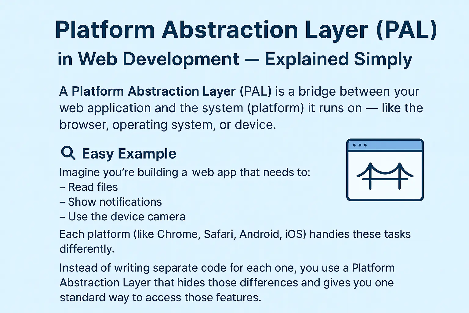
A Platform Abstraction Layer (PAL) is a bridge between your web application and the system (platform) it runs on — like the browser, operating system, or device.
It helps developers write code once that can work smoothly across different platforms (Windows, macOS, Android, iOS, browsers, etc.) without worrying about their internal differences.
In short:
PAL = One Code → Works Everywhere.
Easy Example
Imagine you’re building a web app that needs to:
Read files
Show notifications
Use the device camera
Each platform (like Chrome, Safari, Android, iOS) handles these tasks differently.
Instead of writing separate code for each one, you use a Platform Abstraction Layer that hides those differences and gives you one standard way to access those features.
How It Works
Abstraction
The PAL provides a common interface — meaning you write general code (like camera.open()), not platform-specific code.Implementation
Under the hood, PAL decides how to execute it depending on the platform — e.g., Chrome’s API, Android’s native API, or iOS’s method.
Consistency
It ensures your web app behaves the same way on all browsers and devices, even if those platforms work differently inside.
Real-World Examples
Example | What it Does |
React Native Bridge | Lets JavaScript talk to Android and iOS systems using one common interface. |
Electron’s Node Integration | Allows desktop apps (Windows, Mac, Linux) to access OS features using the same JS code. |
Web APIs in Browsers | The browser provides a PAL so your JavaScript can use camera, file system, or notifications uniformly. |
Why PAL Is Important
Cross-platform support – same code works on multiple devices
Easier maintenance – fewer changes needed for platform updates
Better scalability – future platforms can be added easily
Improved developer experience – focus on logic, not platform quirks